

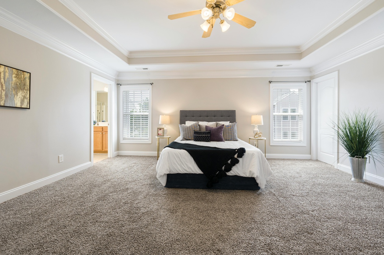
Walking into a room, you probably don't think twice about the carpet beneath your feet. You notice the furniture, the artwork on the walls, maybe the lighting. But here's something fascinating that most people never consider: the carpet color in your home is quietly, persistently influencing your emotions, your energy levels, your sleep quality, and even how you interact with the people you love. It sounds like something out of a science fiction novel, but the research behind color psychology and its relationship to interior spaces — particularly flooring — is both robust and genuinely surprising.
At Lavy's Flooring in Zanesville, OH, we've spent years helping homeowners select carpet that doesn't just look beautiful but actually feels right. And what we've learned is that the difference between a room that energizes you and one that drains you often comes down to something as simple as the shade beneath your feet.
Let's start with a question that seems almost too simple: why does carpet color matter more than wall color? The answer lies in how your brain processes visual information. Your flooring occupies the largest uninterrupted horizontal plane in any room. While your eyes might dart between pictures, shelves, and windows on the walls, the floor is a constant in your peripheral vision. Your subconscious mind is absorbing that color information continuously, even when you're not actively looking at it. Research from the University of British Columbia found that environmental colors affect cognitive performance in measurable ways — and flooring, because of its persistent presence in your visual field, plays an outsized role.
The Warm Spectrum: Reds, Oranges, and Golden Tones
Carpet in warm tones does exactly what the name suggests — it makes a space feel warmer, both in temperature perception and emotional tone. A study published in the journal Color Research & Application found that people in rooms with warm-toned flooring estimated the room temperature to be two to three degrees higher than it actually was. For homeowners in Zanesville, where Ohio winters can be brutally cold, this isn't just a psychological curiosity — it's a practical advantage. A rich, warm-toned carpet in your living room can make those January evenings feel cozier without touching the thermostat.
But warm carpet colors do more than trick your internal thermometer. Burnt oranges and deep reds stimulate conversation and social interaction. There's a reason so many restaurants use warm color palettes — they encourage people to linger, talk, and connect. If your living room or family room is where your household gathers, warm-toned carpet can subtly encourage everyone to put down their phones and actually engage with each other.
The caveat? Highly saturated warm colors can also increase feelings of agitation over extended periods. A bright red carpet might feel exciting at first, but after a few months, you might notice you feel restless or even irritable in that space without understanding why. The key is choosing warm tones that are muted, earthy, or blended — think terracotta, warm taupe, or soft amber rather than fire-engine red.
The Cool Spectrum: Blues, Greens, and Soft Grays
Cool-toned carpets work on the opposite end of the emotional spectrum. Blues and greens are associated with calm, focus, and mental clarity. There's a reason hospitals and therapy offices often feature cool color palettes. For bedrooms, cool-toned carpet can genuinely improve your sleep quality. Your brain associates blue and green tones with natural environments — sky, water, foliage — and these associations trigger a subtle relaxation response that can lower your heart rate and ease you into restful sleep.
For home offices, which have become increasingly important since the shift toward remote work, cool-toned carpet can measurably improve productivity. A 2019 study from the University of Texas found that workers in blue-toned environments made fewer errors and maintained focus for longer periods compared to those in warm-toned or neutral environments. If you've been struggling with concentration while working from home, your carpet color might be part of the equation you haven't considered.
Gray carpet has surged in popularity over the past decade, and there's a psychological reason beyond its aesthetic versatility. Gray is perceived as sophisticated and stable, creating a backdrop that allows other design elements to shine without competing for attention. However, too much gray — particularly cool, dark gray — can create feelings of detachment or even mild depression over time. If you love gray carpet, balance it with warm accessories, natural wood tones, and plenty of natural light.
The Neutral Zone: Beiges, Creams, and Soft Browns
Neutral carpets remain the most popular choice for a reason that goes deeper than resale value and design flexibility. Psychologically, neutral-toned flooring creates a sense of groundedness and stability. These colors mimic natural earth tones — sand, stone, soil — and they tap into deeply embedded associations with safety and shelter that humans have carried for millennia.
Beige and cream carpets are particularly effective in transitional spaces like hallways and staircases, where your brain needs to process movement and spatial orientation. These neutral tones reduce cognitive load, making transitions between rooms feel seamless and natural rather than jarring.
Soft brown carpet has an interesting psychological profile. It's simultaneously warming and calming — a rare combination that makes it exceptionally versatile. Brown tones are associated with reliability, comfort, and natural authenticity. In a world that increasingly feels artificial and overstimulating, brown carpet creates a space that feels genuinely restful without being cold or clinical.
Texture and Color: The Overlooked Combination
Here's where things get really interesting. The psychological impact of carpet color is significantly modified by texture. A deep blue carpet in a smooth, low-pile texture reads as modern, crisp, and professional. The same blue in a plush, high-pile texture feels luxurious, cozy, and intimate. Your brain doesn't process color in isolation — it integrates color with tactile information, even before you touch the carpet. The visual texture of flooring creates expectations about how it will feel, and those expectations shape your emotional response to the entire room.
This is why choosing carpet isn't just about picking a color swatch from a catalog. It's about experiencing the carpet in context, understanding how the interplay of color, texture, pile height, and light will create a specific emotional environment. It's also why working with experienced flooring professionals makes such a meaningful difference in the final result.
Dark vs. Light: The Spatial Psychology
Beyond specific colors, the value of your carpet — how light or dark it is — affects your spatial perception in powerful ways. Light carpet makes rooms feel larger, more open, and airier. Dark carpet makes rooms feel more intimate, enclosed, and cozy. Neither is inherently better; the right choice depends on the emotional function of the space.
A small bedroom with dark carpet can feel like a protective cocoon — perfect for sleep. A small living room with the same dark carpet might feel claustrophobic and oppressive. Conversely, light carpet in a large, open living area creates a sense of expansiveness and freedom, while in a cavernous room that already feels impersonal, it can make the space feel even colder and more sterile.
Practical Application: Room-by-Room Recommendations
Understanding color psychology transforms carpet selection from a purely aesthetic decision into a strategic one. For bedrooms, lean toward soft blues, gentle greens, or warm neutrals in plush textures. For living rooms and family spaces, warm neutrals or muted warm tones encourage connection and relaxation. For home offices, cool blues or greens in low-pile textures support focus and productivity. For children's rooms, soft, warm colors with some visual interest support creativity without overstimulation. For basements and media rooms, deeper tones create the intimate, immersive atmosphere that makes movie nights and game sessions feel special.
The team at Lavy's Flooring in Zanesville, OH understands that choosing carpet is about so much more than matching a color to your curtains. It's about creating an environment that supports the life you want to live in every room of your home. Whether you're renovating a single room or selecting flooring for an entire house, we bring decades of experience and a genuine passion for helping our neighbors create spaces that look beautiful and feel exactly right. Stop by our showroom and experience the difference that thoughtful, expert-guided flooring selection can make. Your floors are the foundation of every room — let's make sure they're working for you, not against you.


